It’s the end of a month which means only one thing round these parts, a massive and possibly illegal dumping of sketch stuff and scraps from the auld decrepit iPad.
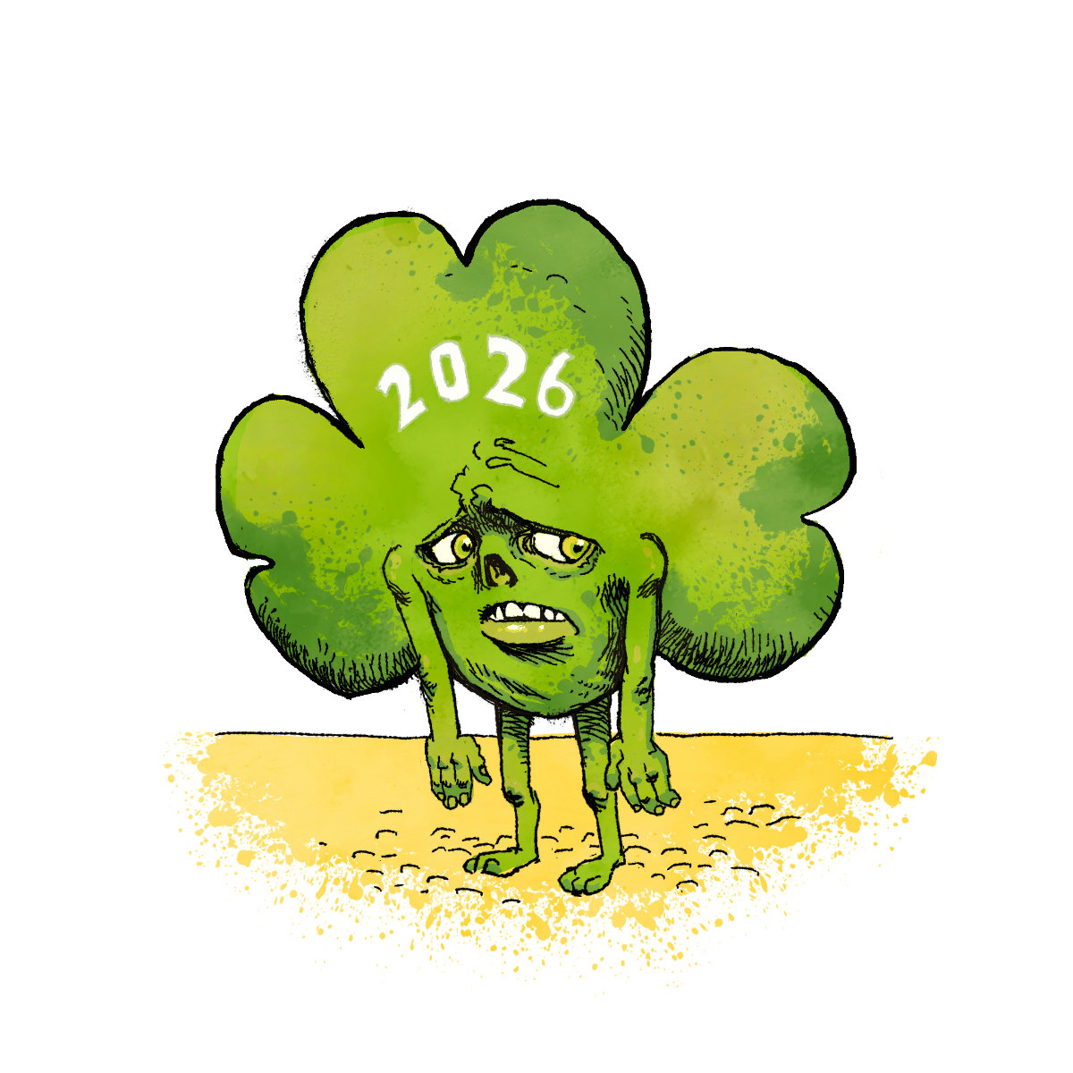
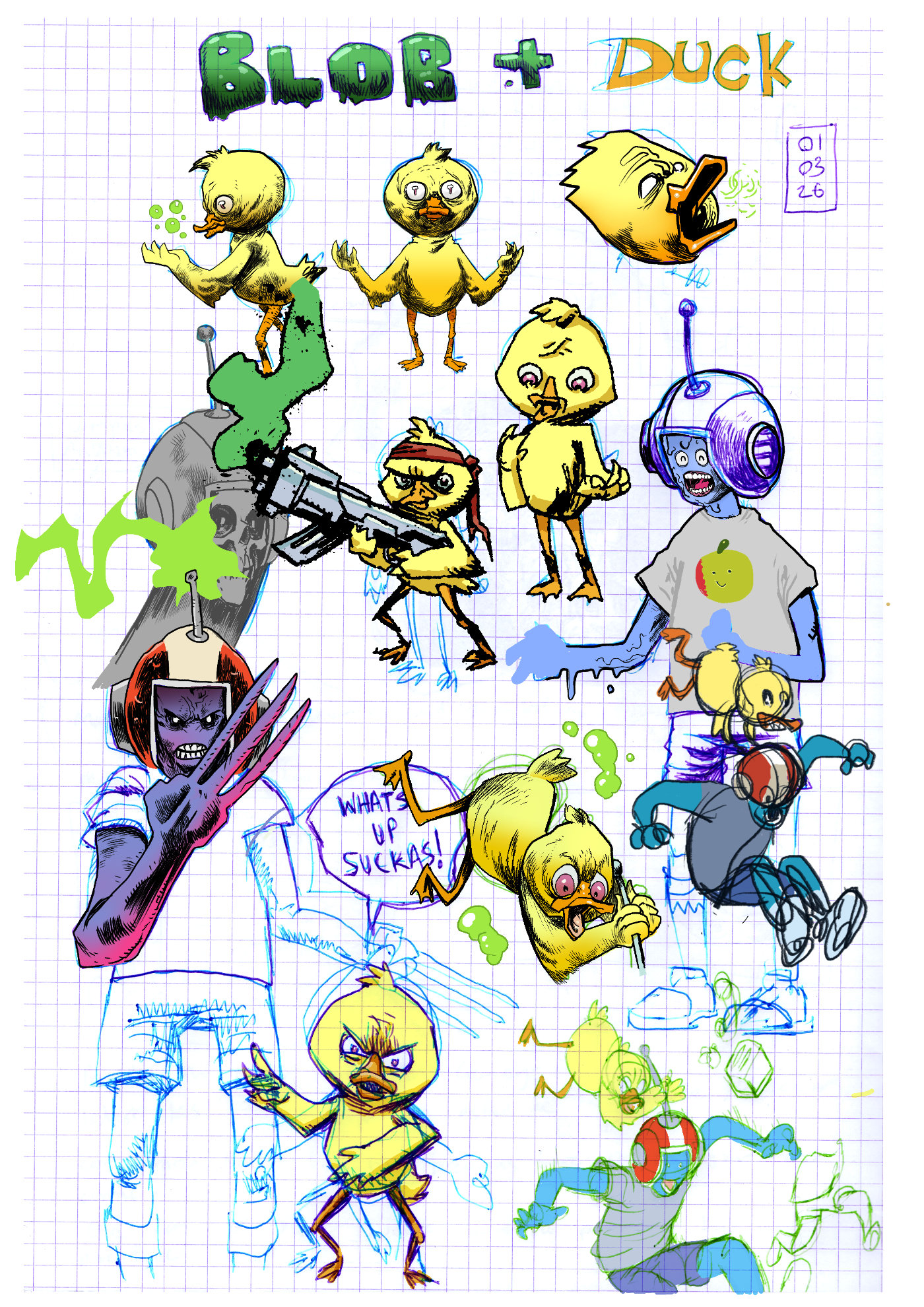
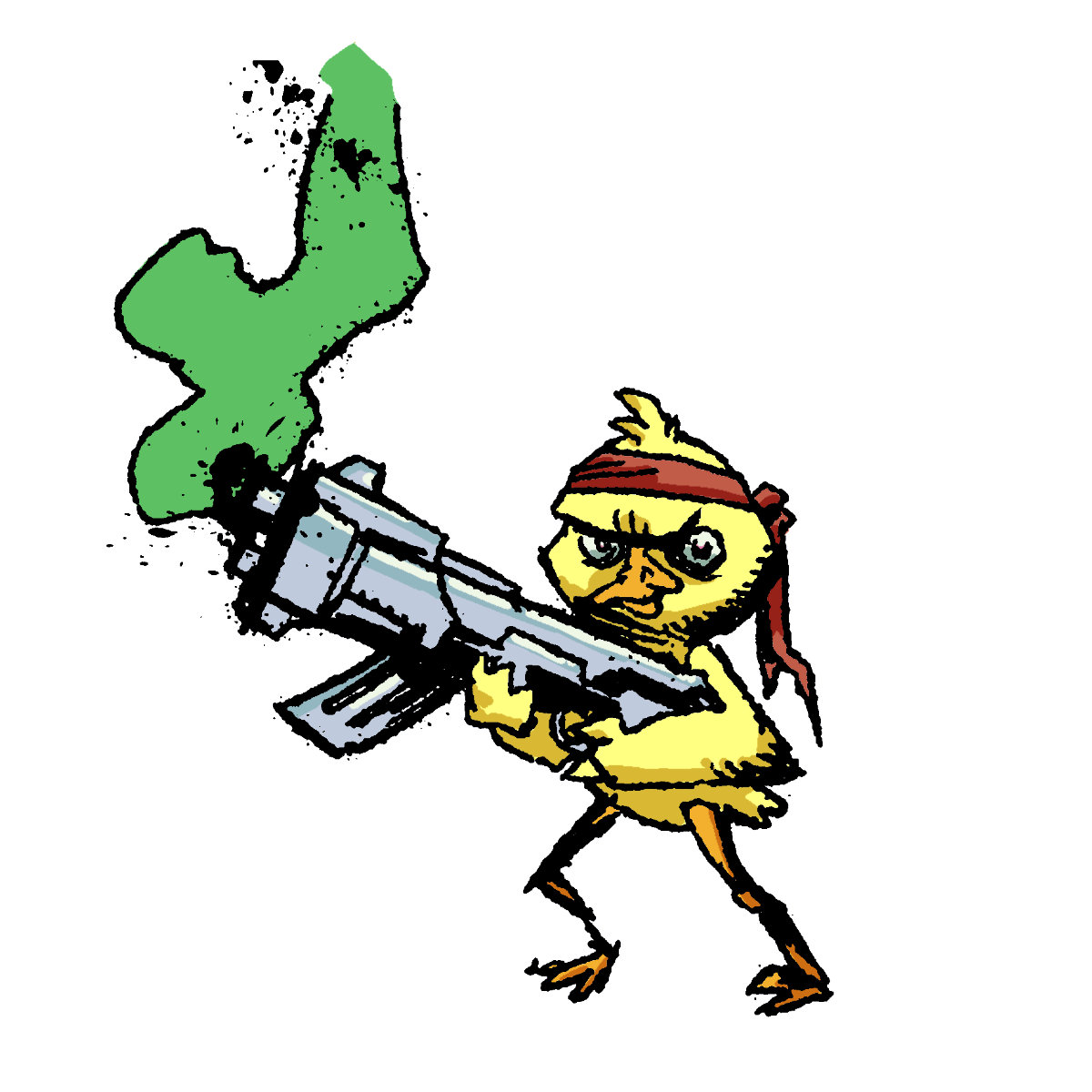
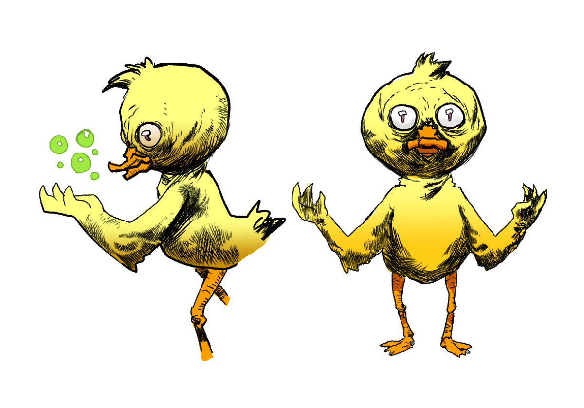
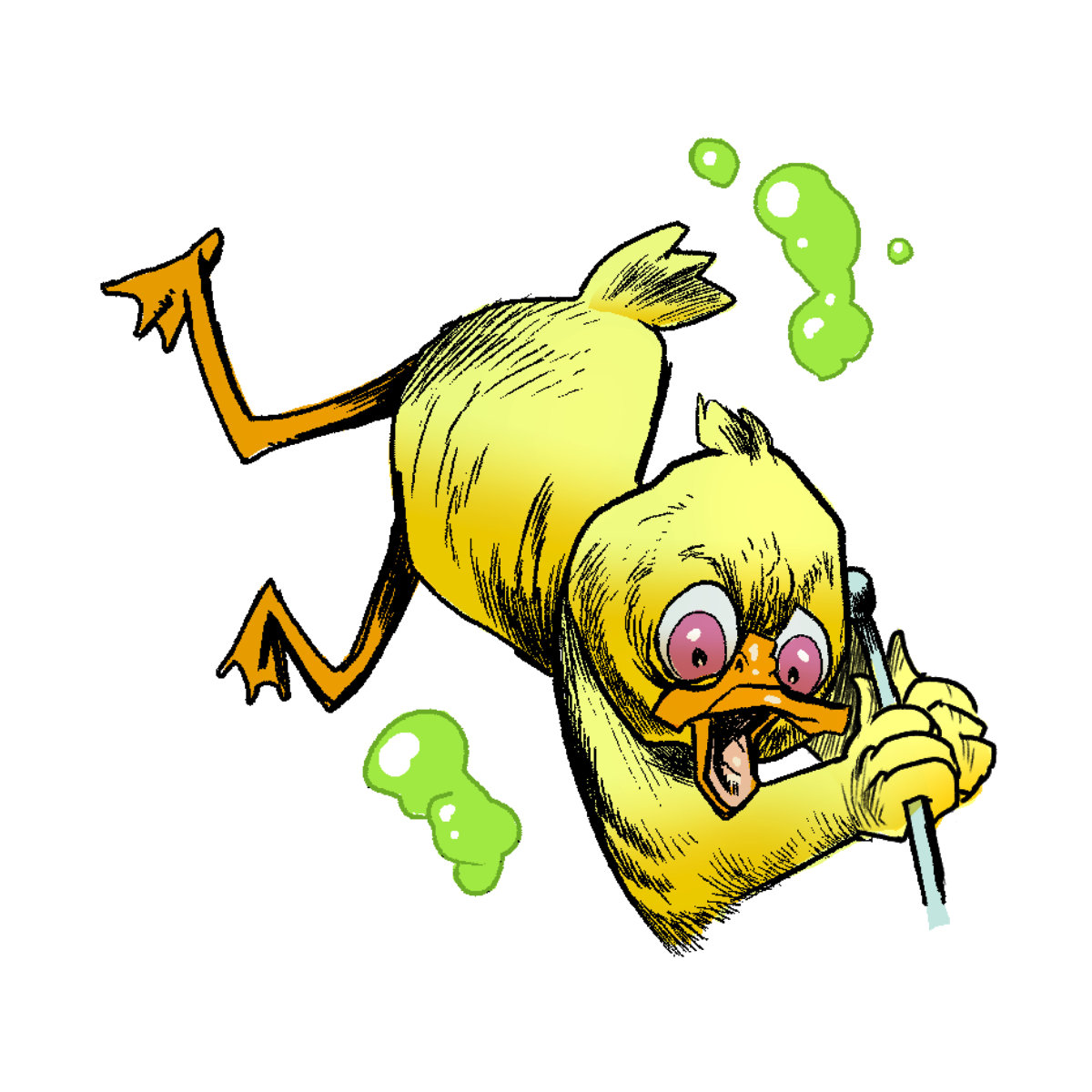
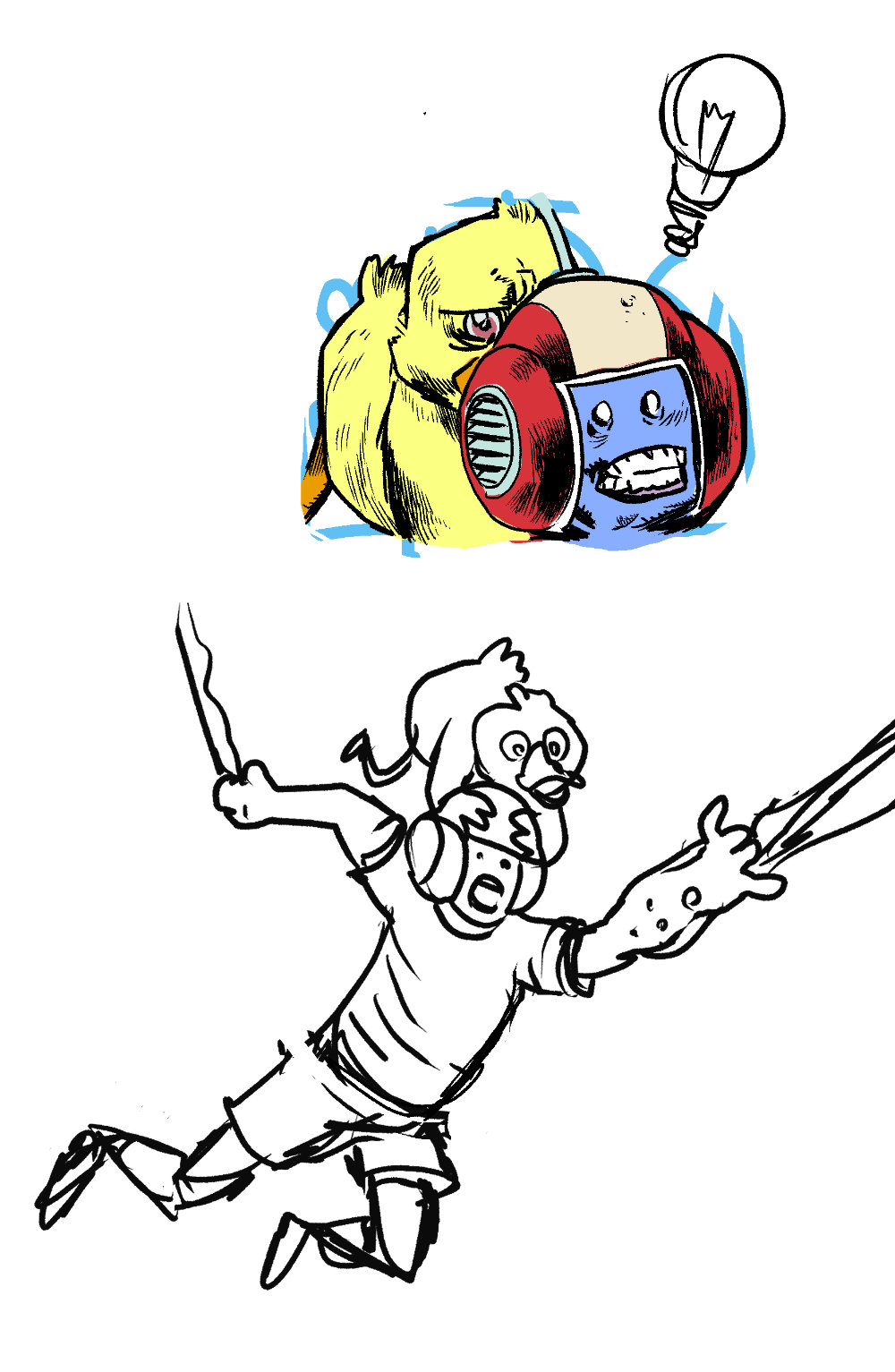
Paddy’s day was definitely a thing that happened in March…. I worked up this sad lad in procreate and then completely forgot all about itLooking again at the initial sketches I prob should have drawn the wee guy dangling from the pint glass with his arse outI drew a bunch of Blob & Duck by Lobster RobinStruggled a bit to turn that duck falling pose into something goodAbsolute characters are so hot right now
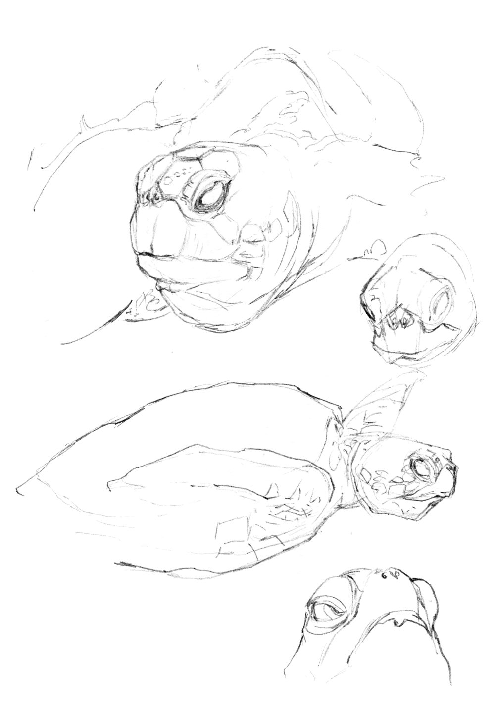
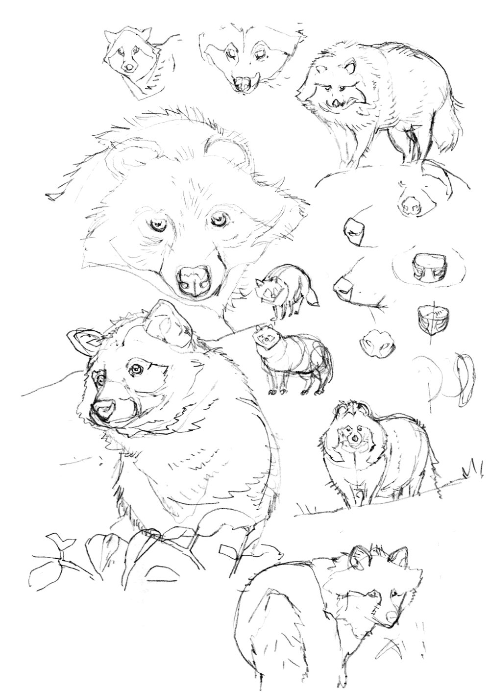
Continued #animalstudies with some great suggestions on Cara including the Tanuki, which admittedly I was not aware of, such a delightful creature if a little tricky to draw.
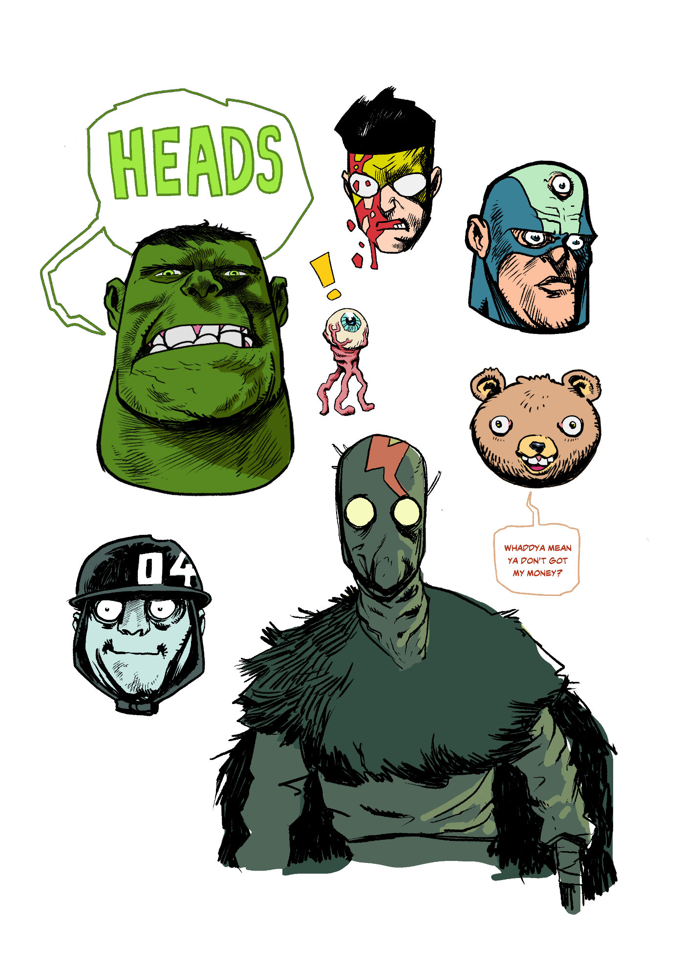
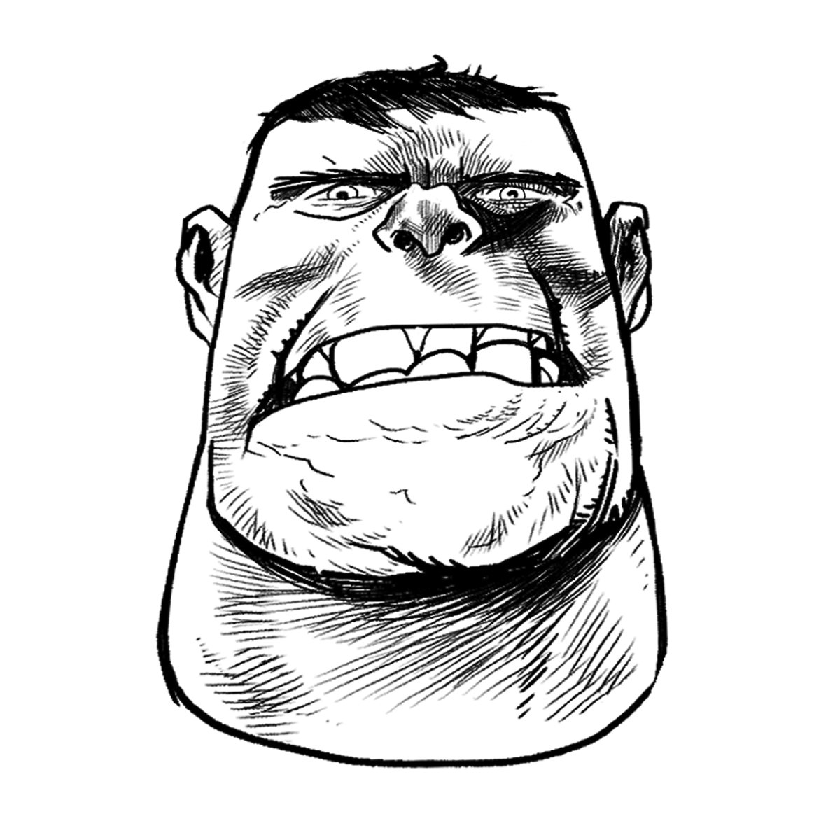
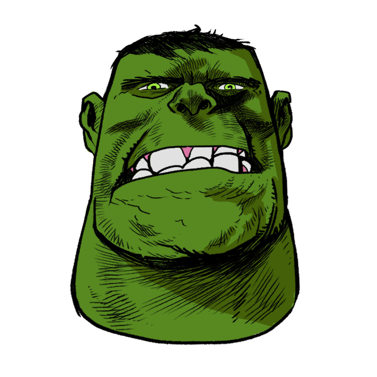
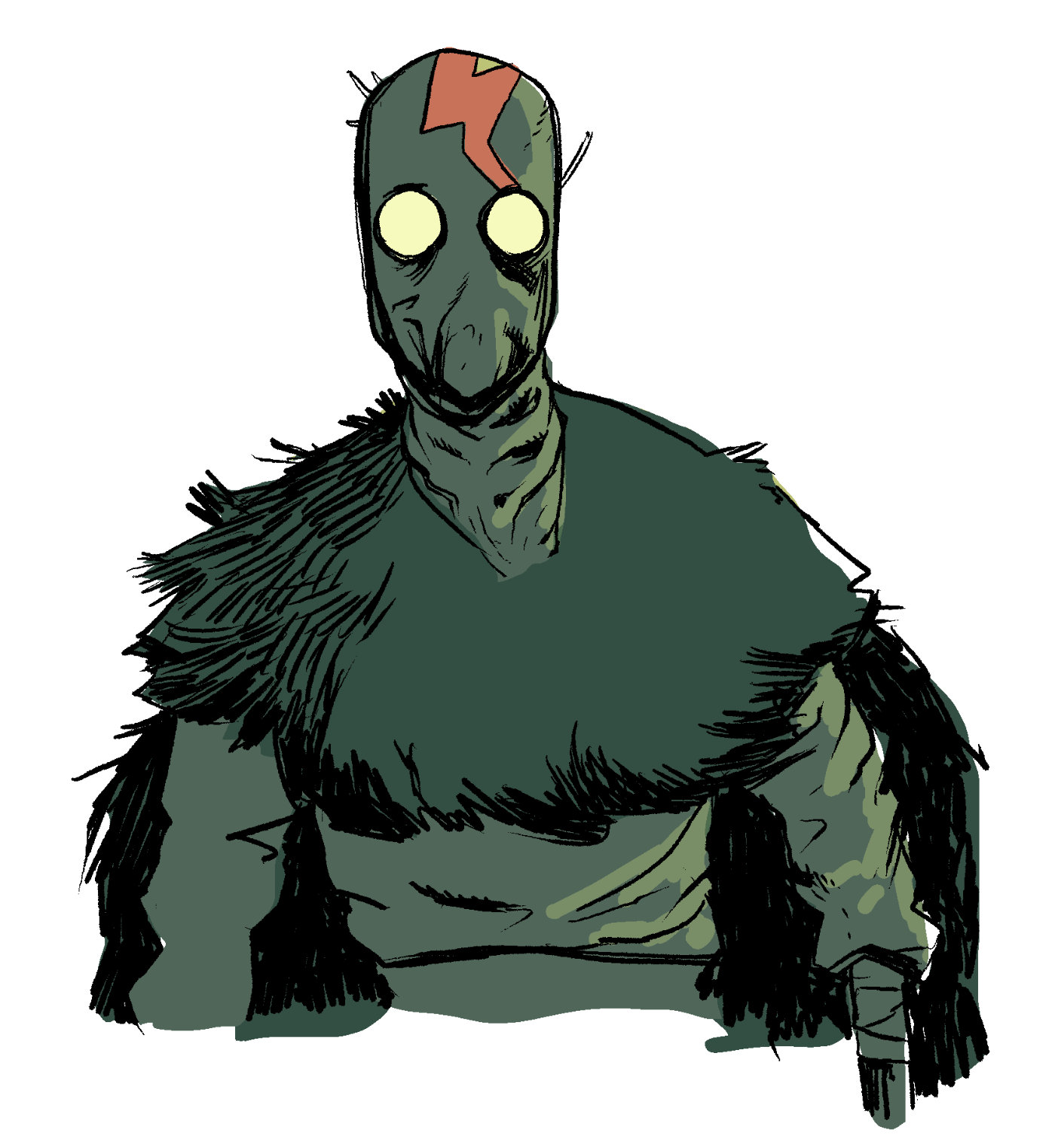
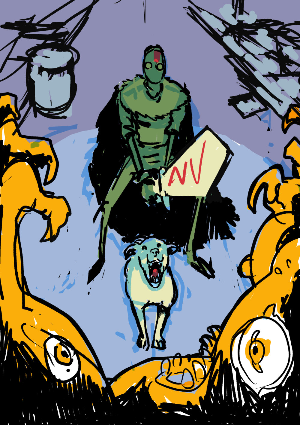
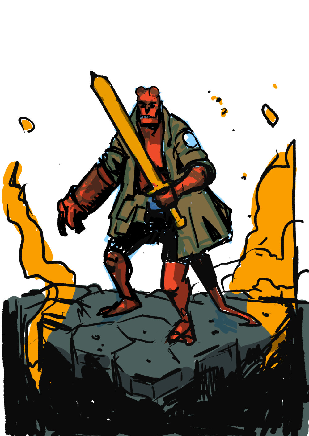
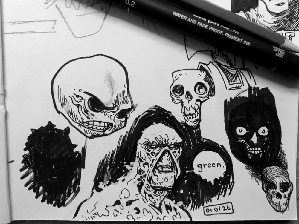
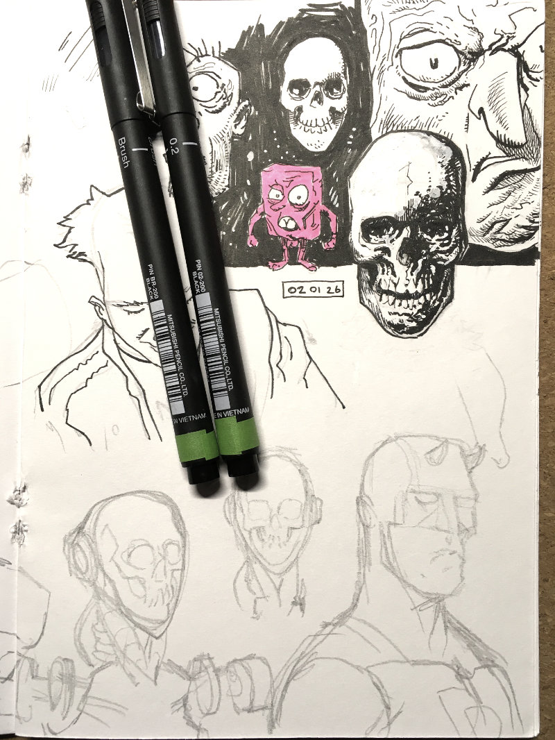
Walking eyeballs were cool before Alien Earth ya know, at least in my bookHulk not have TMJ, Hulk just a little stressedReally like the colours on this Rathraq, picked them out pretty quickly tooWas curious to see if I could do something similar in a larger fan art piece, might revisit this in AprilOne fan art leads to another with some Hellboy doodling, might give him an axe instead
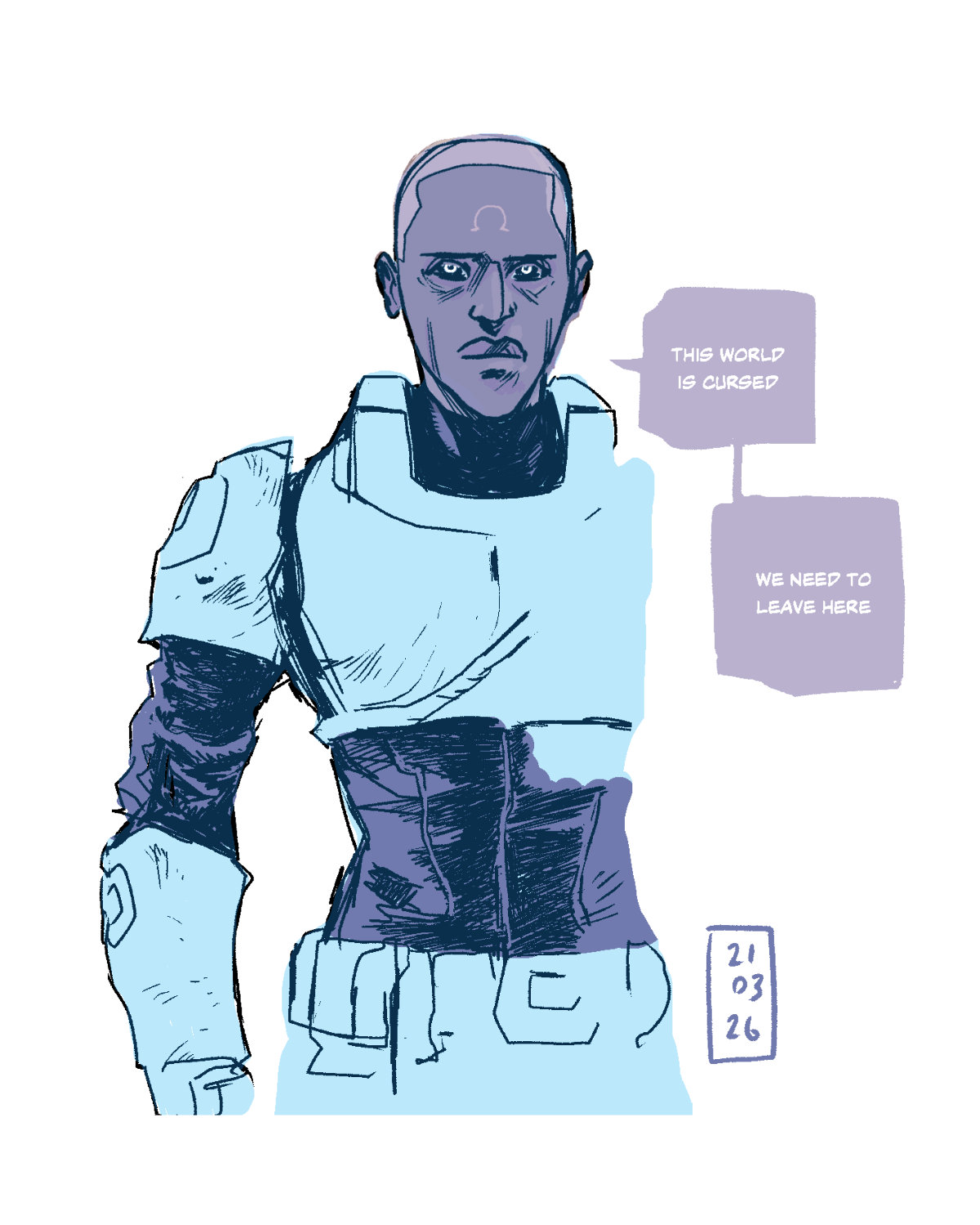
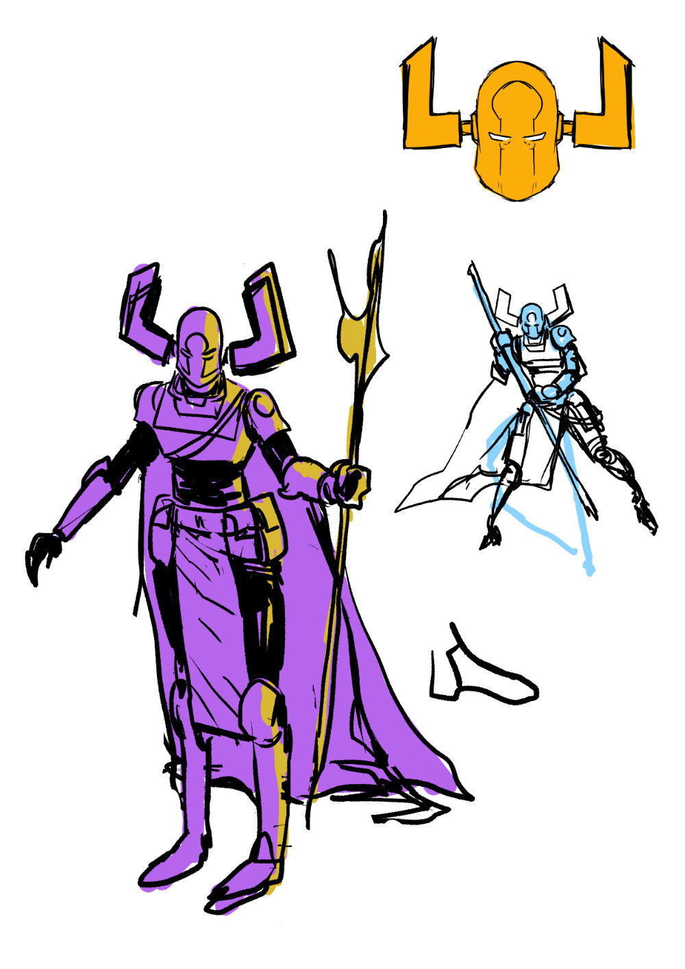
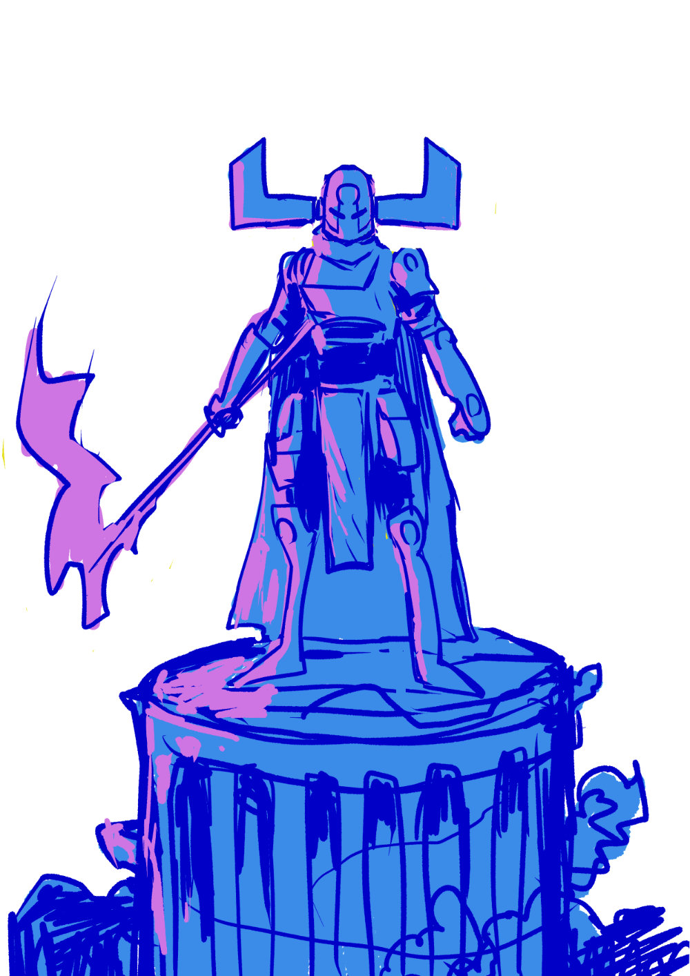
I’ve been enjoying Terran Omega by PJ Holden but haven’t really figured how to approach the character. Think I’m getting closer here but still doesn’t feel like it’s on model as such/captures the right feel… I dunno.
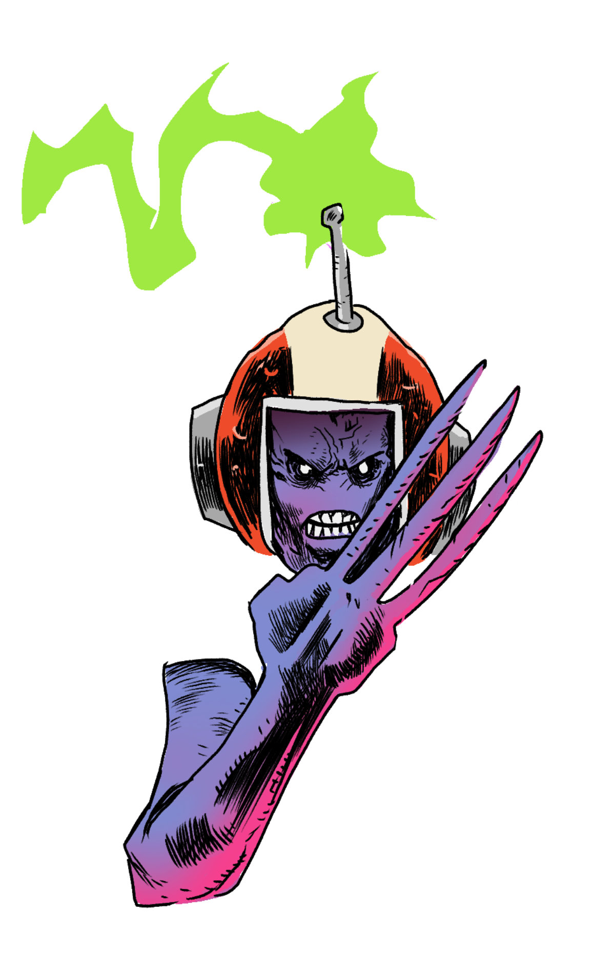
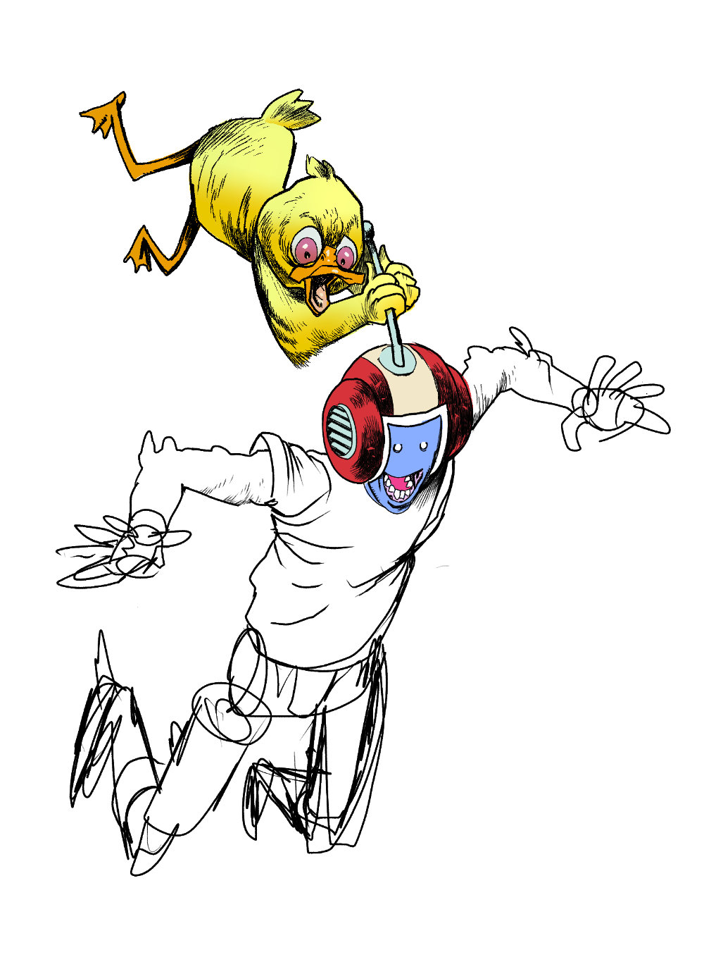
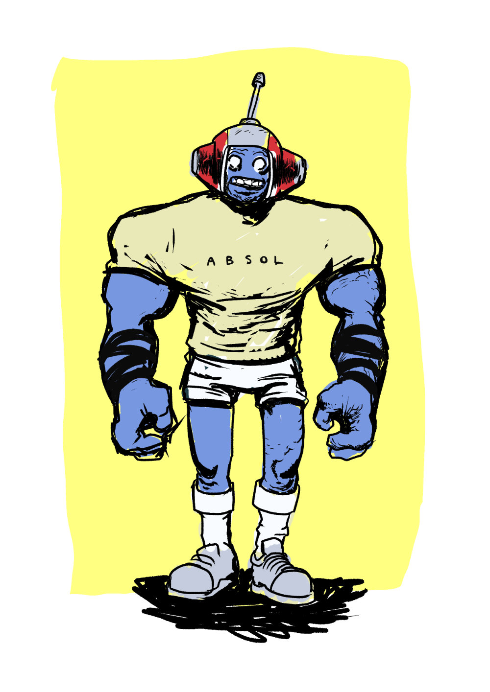
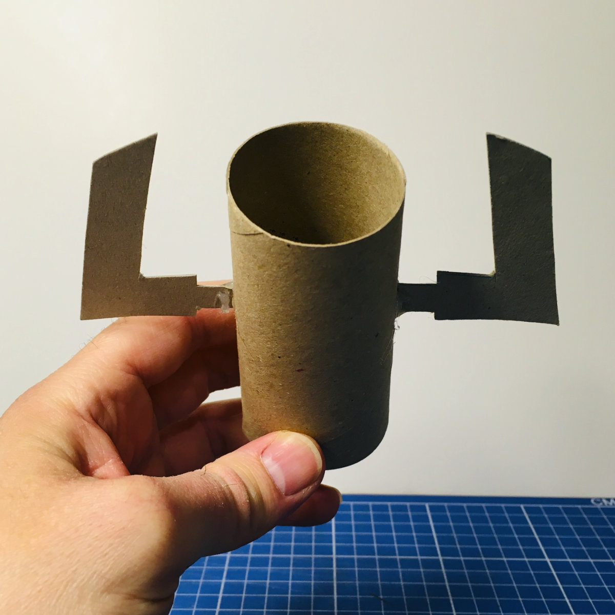
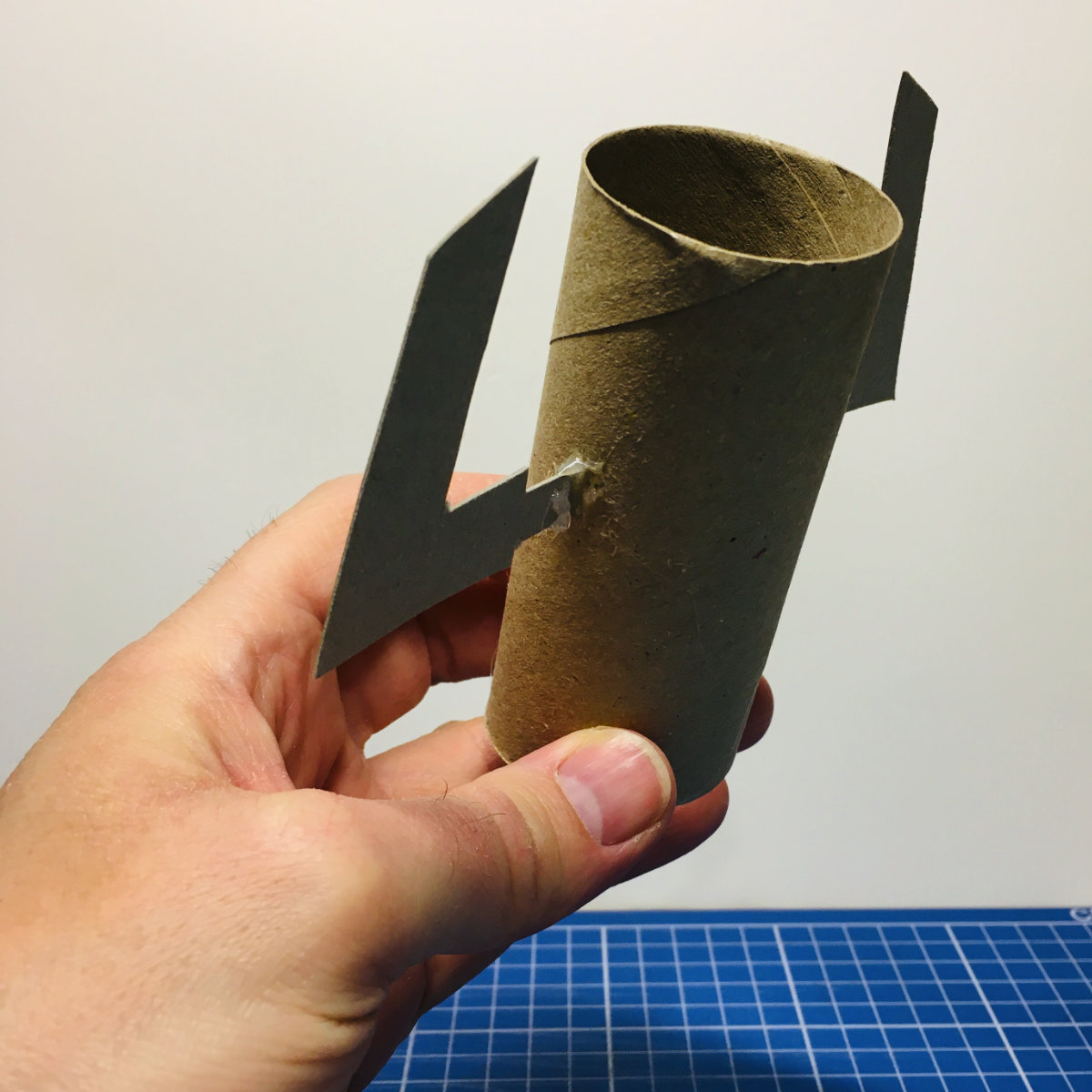
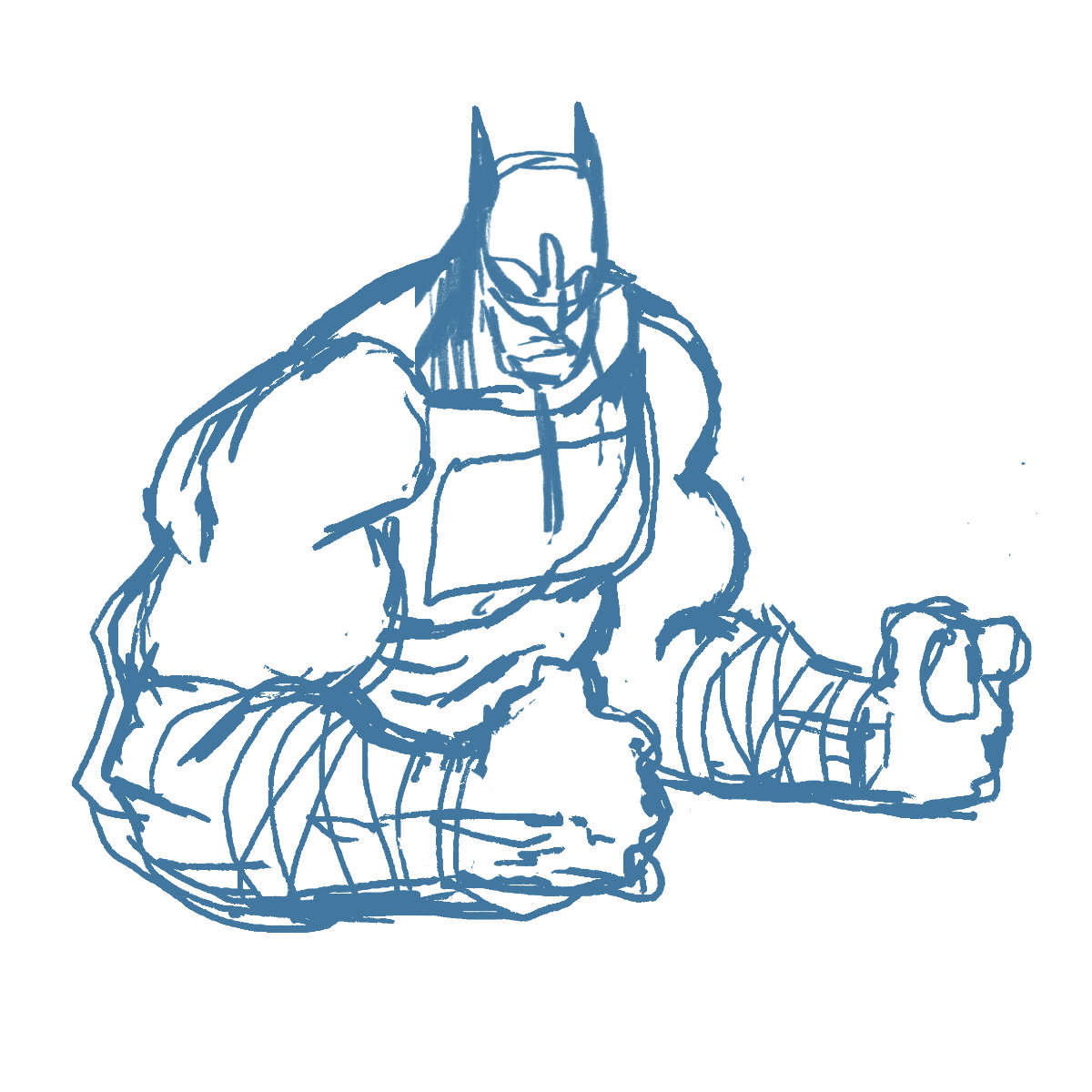
Tricky to balance the feminine physique of Terran with the armour, etc.I mocked up a rough Terran helmet in card for referenceAbs Bats brings the gun show to close this out
Moving the pen, wanna make it a daily habit this year
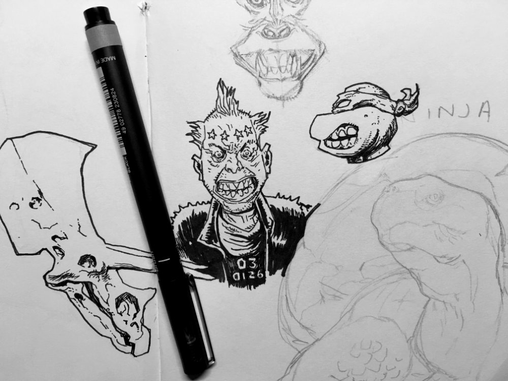
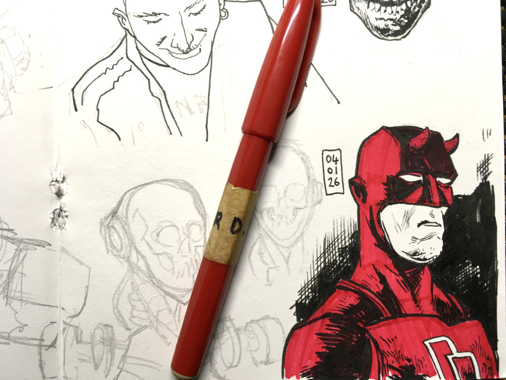
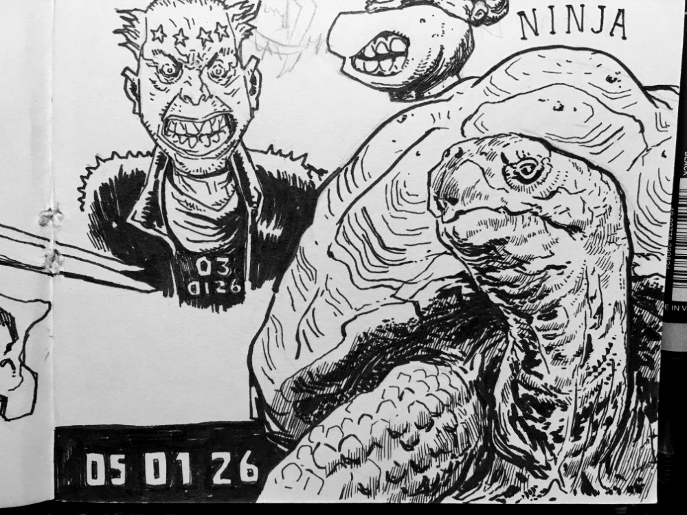
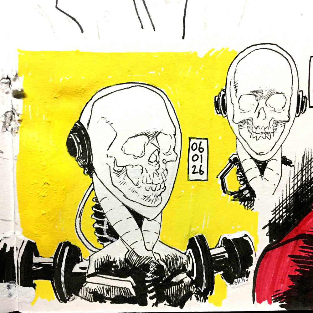
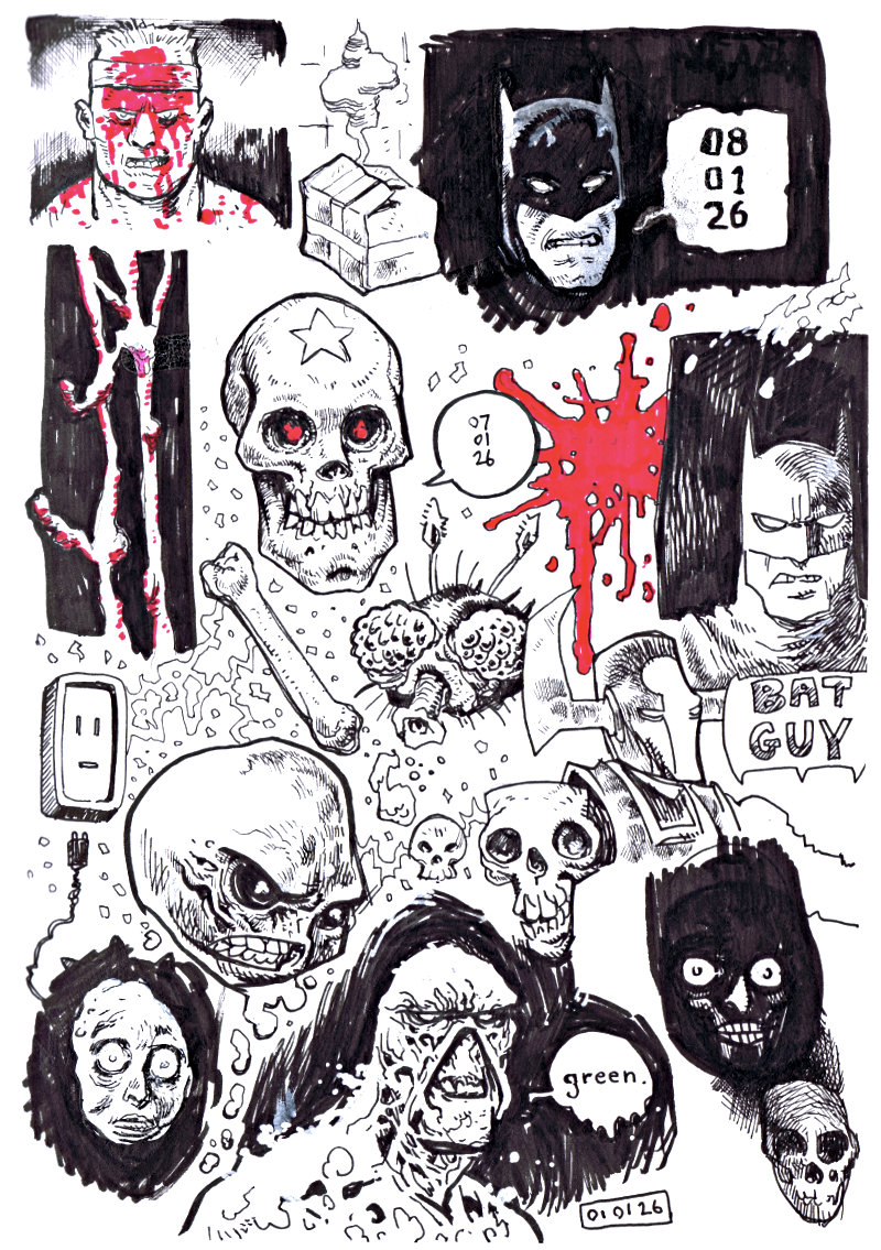
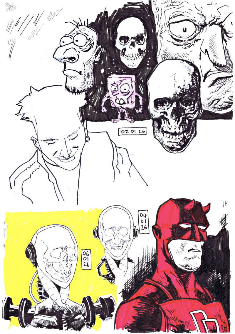
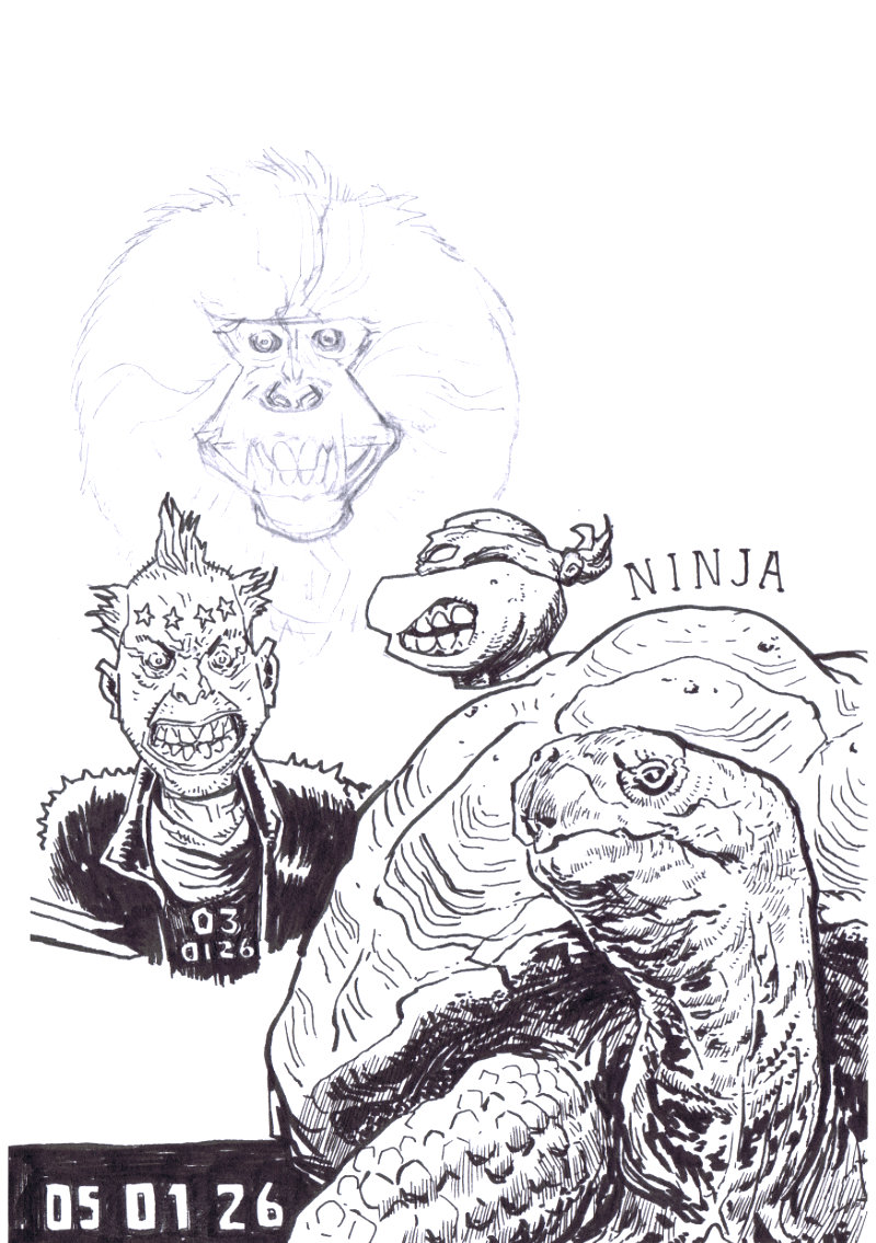
2 Jan 2026
Photos shared to my bluesky and cara accounts
It’s been surprisingly difficult to carve out the time to draw each day this week. Something that years ago before the birth of my son seemed so easy to me, necessary even and often ritualistic. I always feel better when I draw, there’s a surprise of sorts and a meditative stillness that I find myself within. I’m not sure what I’ve missed more really, creating something from nothing or just the quiet escape that drawing provides for me.
The biggest challenge I’ve found has been settling on something to draw, mainly finding the inspiration or spark to start. I’m just trying to draw through it really, hoping that if I sit at the table long enough and fill enough pages something will catch. I’m probably just tired and lacking concentration, motivation and intention.
When you set some time aside to draw for yourself you feel a pressure to make it worthwhile. After 10 or 20 minutes of noodling at something or rubbing out pencils the inner critic gets louder and the urge to give up is strong.
I’ve been here before and I know I just need to lower my expectations and have fun.
Raw scans of the sketchbook pages
With that in mind I think I’ll keep at this wee sketchbook, I just might not post anything more from it on SM, I’ve got into a bad habit of measuring the quality of my work in likes, comments, and follows.
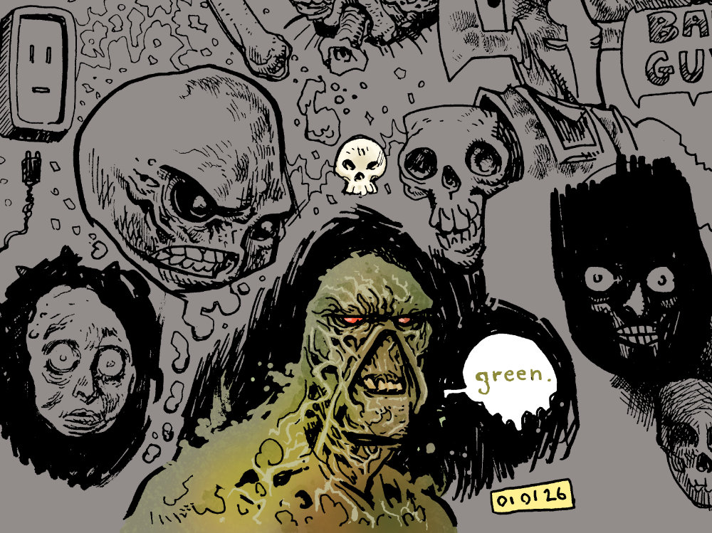
Some quick colours in procreate
If you’ve made similar plans to draw daily this year, let me know what’s keeping you motivated in the comments. Also, if there is anything you’d like to see me draw, I’d love to hear it!
Bed time doodles in Clip Studio Paint… you should see the ones I didn’t includeThe colours did a lot of the heavy lifting on big chin here
Had a pretty good response to the Dredd sketch on bluesky, a big surprise really, I haven’t seen much reaction to anything I post there honestly, lucky to get a reply or comment at all. Haven’t drawn any Dredd stuff in years, the helmet is always tricky but this looks alright… it might even be a new favourite of mine. The Eastwood of this is entirely accidental btw, couldn’t resist adding a wee speech bubble nod to auld dirty Harry.
Not a great HB, but I like how the colours turned outBit of a wonky sketch but who cares right?! (I mean, I do actually, it’s bloody wonky)
Was in two minds about posting this Ultramega but I’ll let it slide as I’ve already put it on insta… that’s late night posting for ya. Someday I’ll do a decent drawing of this awesome character and melt some eyeballs.
Messing around in Procreate while watching telly, I should do this more oftenMy wee dude wasn’t feeling so hot the other day, lotta sketching and sleepingMy son has discovered colour drop in procreate and it’s quickly become part of the evening routineQuick sketch for #tmntday
Not much time for drawing but I’ve been adding to these larger pages of bedtime doodles, sketching some favourites and other stuff.
Love these lil guys from common side effectsWhole lotta skulls sketched at work on various scraps, adjusted in CSPSome fanart sketching for I took a hammer to hellAll hail the squeaky one
The comics machine Matt Garvey kindly asked me to provide a variant cover (my first cover) for the latest issue of Gangsters v Monsters. Look at that preview art by the awesome Andrea Schiavone! So good!
After sketching a few of the characters and initial ideas on paper I worked up a quick cover layout guide in affinity designer and imported the logo files. I then exported the guides to clip studio paint as a draft layer and scanned in some of my loose sketches.
I switched between procreate and clip studio to create the thumbnails, for some reason thumbnailing was just easier in procreate.
I liked all four of these and couldn’t really decide on a favourite, they all would have been fun to draw, honestly.
Initial set of thumbnails with roughly spotted blacks
After receiving confirmation from Matt on the second thumbnail I started inking the mummy head first, followed by the werewolf before tackling the rest. I decided very quickly to limit the brush size to 0.4, 0.8 and 1.0 for consistency. In hindsight I prob went a little overboard with the texture on the mummy in contrast to the other characters.
Rough sketch to final inks in clip studio paint
I haven’t really been colouring much this last year so took a few hours to refamiliarise myself with some basic techniques before flatting the file, practicing on this art from the previous post.
Flatting WIP, lotsa layers, some would say too many
I had a lot of difficulty nailing down my colour palette and worked up some rough options after finishing the flats.
Colour roughs
I coloured this over a few days so decided to create a reference page in clip studio to remind myself of the brushes and combinations used. It was very quick to put together and saved me a good bit of time in the end thankfully.
Colouring brush testsFlats to final colours
I had a blast on this and now that the project has surpassed its goal I’m really looking forward to seeing this in print come December.
Shout off in the comments if you’re getting a copy, I’d love to hear from ya!
Nope, not doing it, you can’t make me, what’s that?… you’ve made a list of prompts with vague references and obscure characters appealing to my unquenchable nostalgia… ahhhhh, hmmmm… maybe I could… just one a week… or maybe seven at the weekends and post them together in a batch… collect em in a zine… release it on gumroad… that could be fun… I could make it woargghhhhhhhhhhh!!! Damn yooouuuu October!!!! You vile cursed month! Every fraggin year!
Anyway, now that I’ve cleared that up, please enjoy these random drawings.
My old Belfast comics meet-up pal Stephen Downey turned 40 recently and I quickly sketched up some fan art of his latest @outsidergames project Tax-Force. It’s heavily influenced by the X-Men animated series which is basically all you need to know, go wish-list it on your computer.
Wee goblin inspired by @boe_ink latest posts on instagram, goblins are good craic.
Had a go at the new bats and that axe, lotta fun and it got me excited to pick up the first issue this week. Since reading it though I think these henchmen dudes are supposed to be wearing ape skulls, oh well.
Look… it’s been a long week and an even longer weekend, it’s times like these that the Jarbats will emerge in the sketchbook… meesa not sorry.
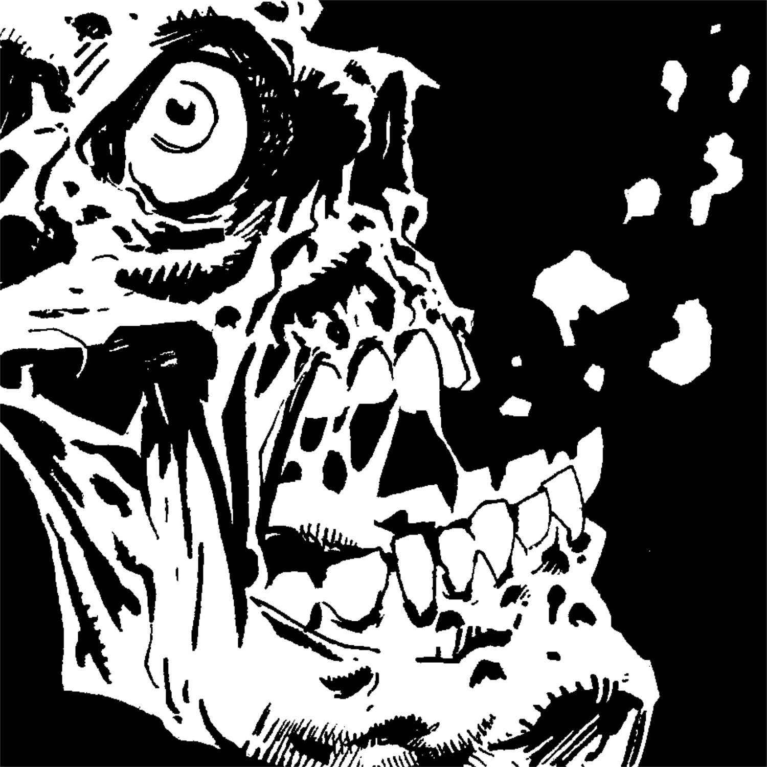
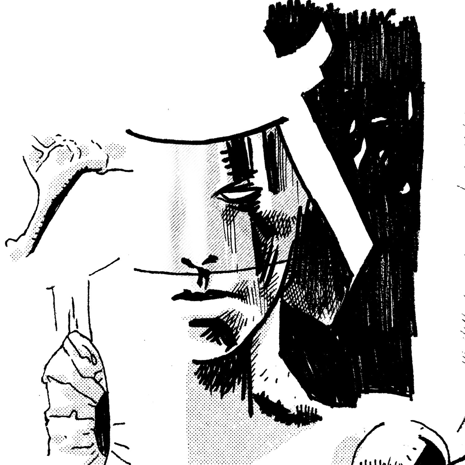
The obligatory self portrait… feeling greatSomeday soon I’ll get sick of drawing skulls with high foreheads… but it is not this dayA wee inking test using posca markers (grey added in CSP) – leave a caption in the comments to win a no-prizeSome post-it ghouls from the sketchbook… oooohhhhh aaahhhh *cough* oooohhhPrefer the rough pencils for this, oh wellServed this guy at work and had to sketch his sai tattoos, he now lives in my head as a fixer for the occultI’ll eventually get round to my MarvelUKtober stuff again but here’s a Digitek tease